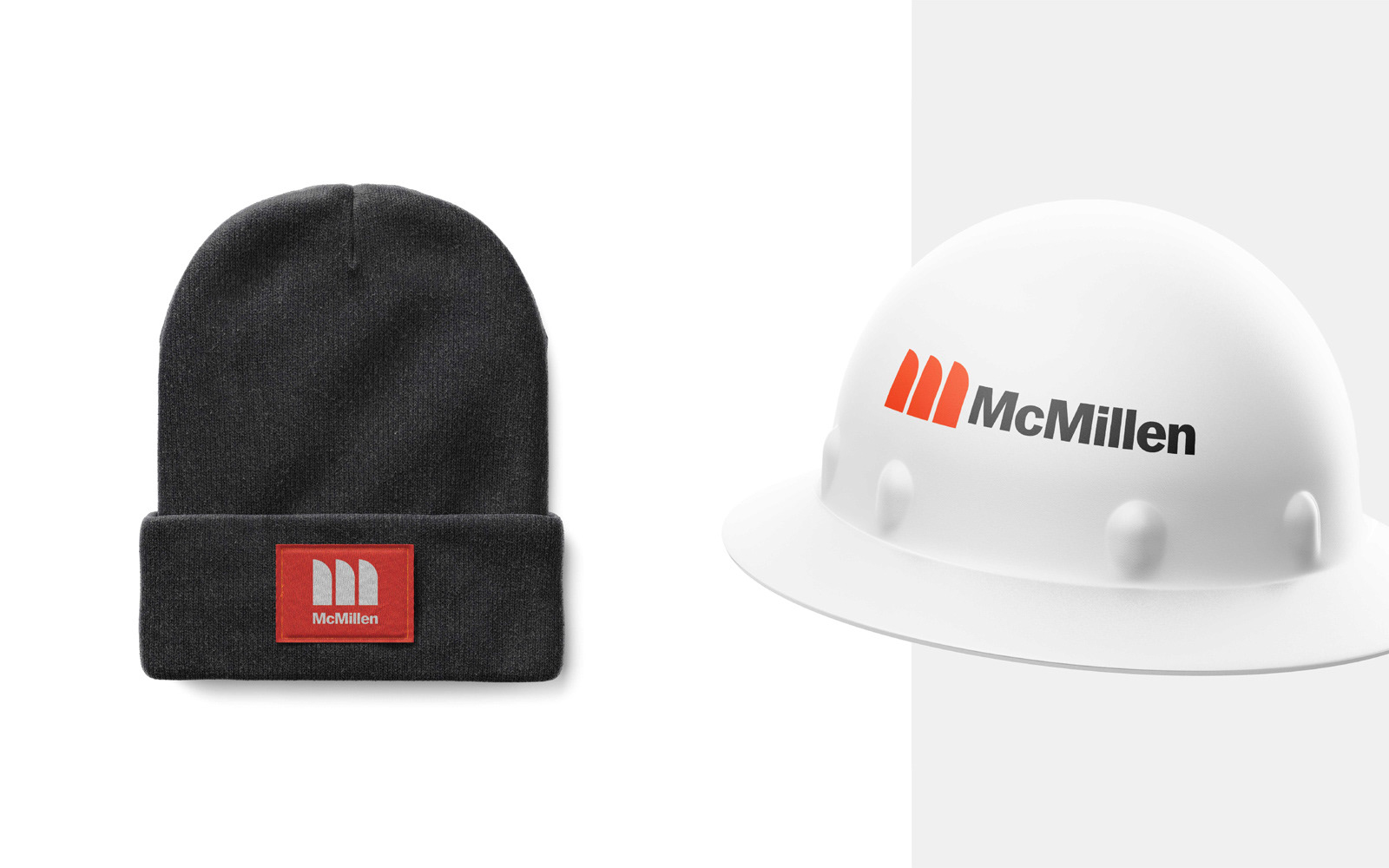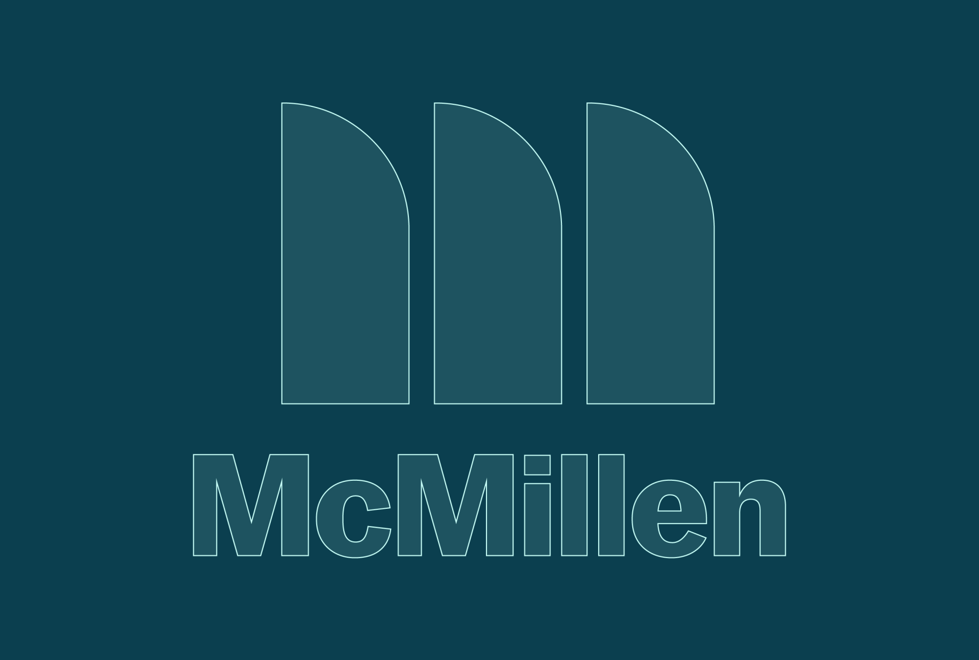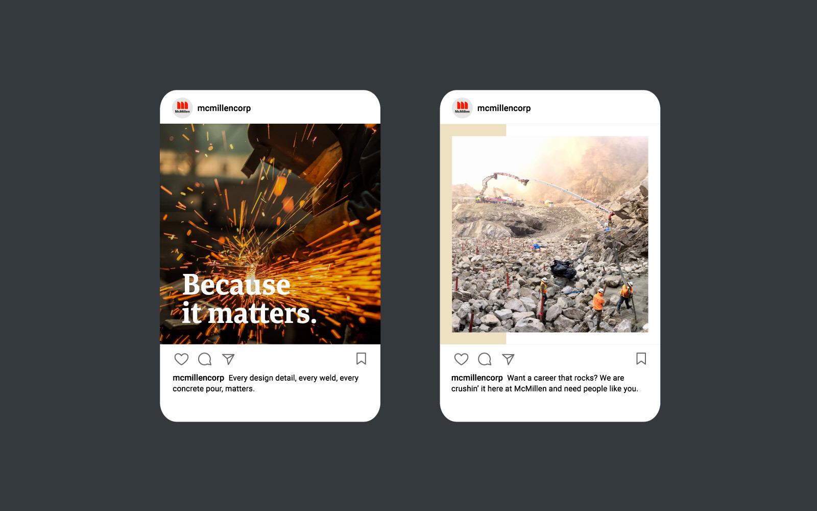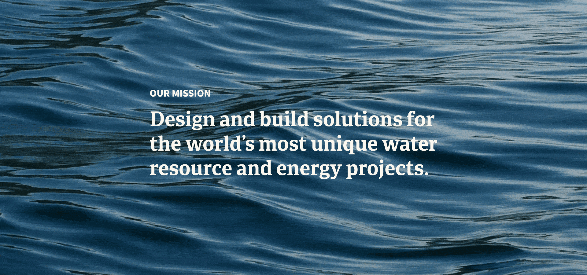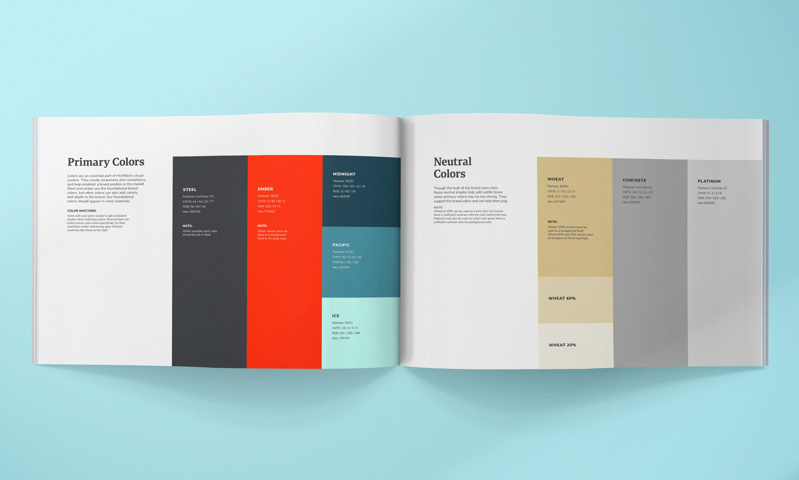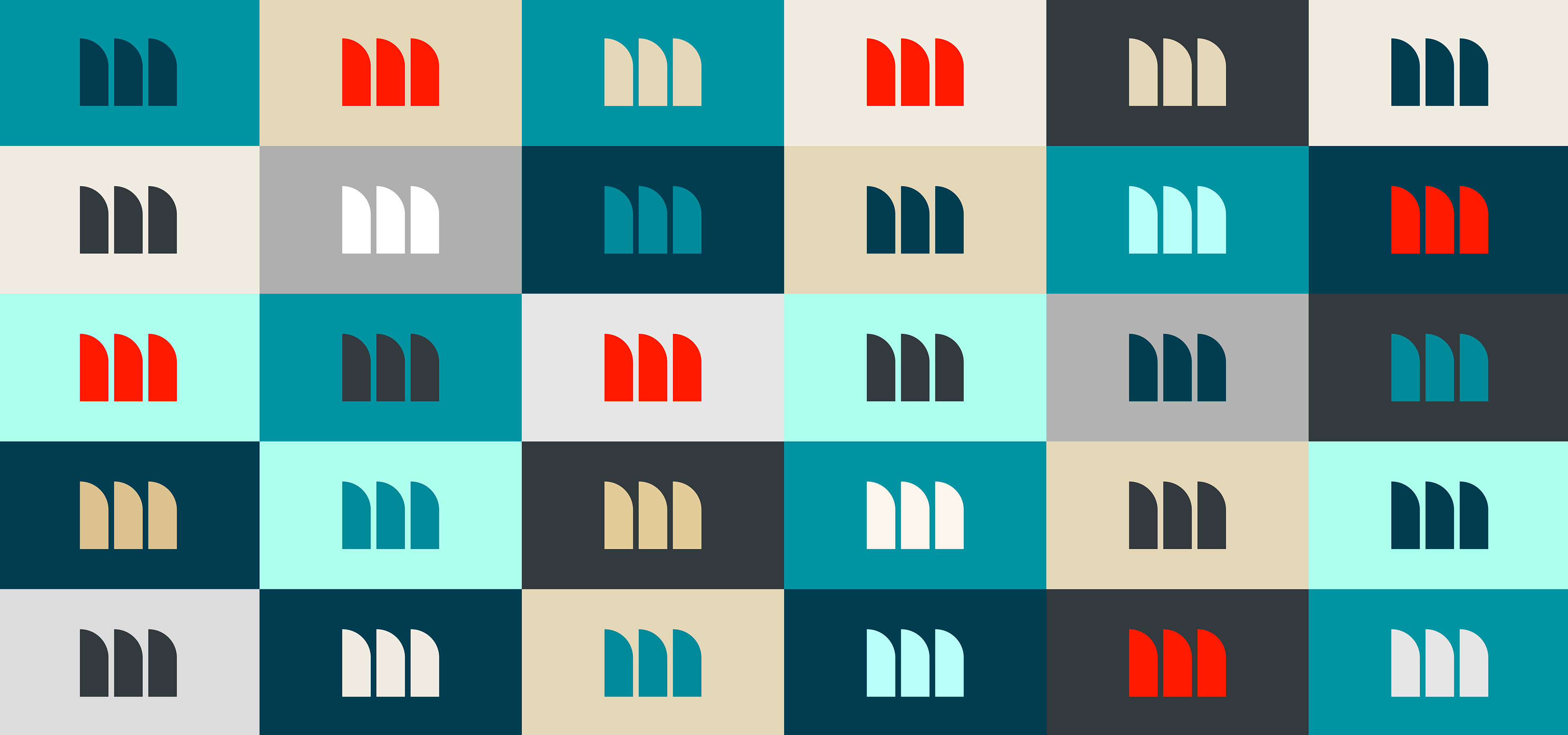


After splitting off from a previous merger, McMillen came to us in need of a brand that reflected their forward-thinking, technology-driven approach to hydro-engineering. The three arches in the logo don’t just hint at dam spillways, they’re also a nod to their three key business pillars: Energy, Water Resources and Aquaculture. Combined with an energetic color palette and modern logotype, their new brand has both inspired their workforce and also led to an increase in sales and job applications.