
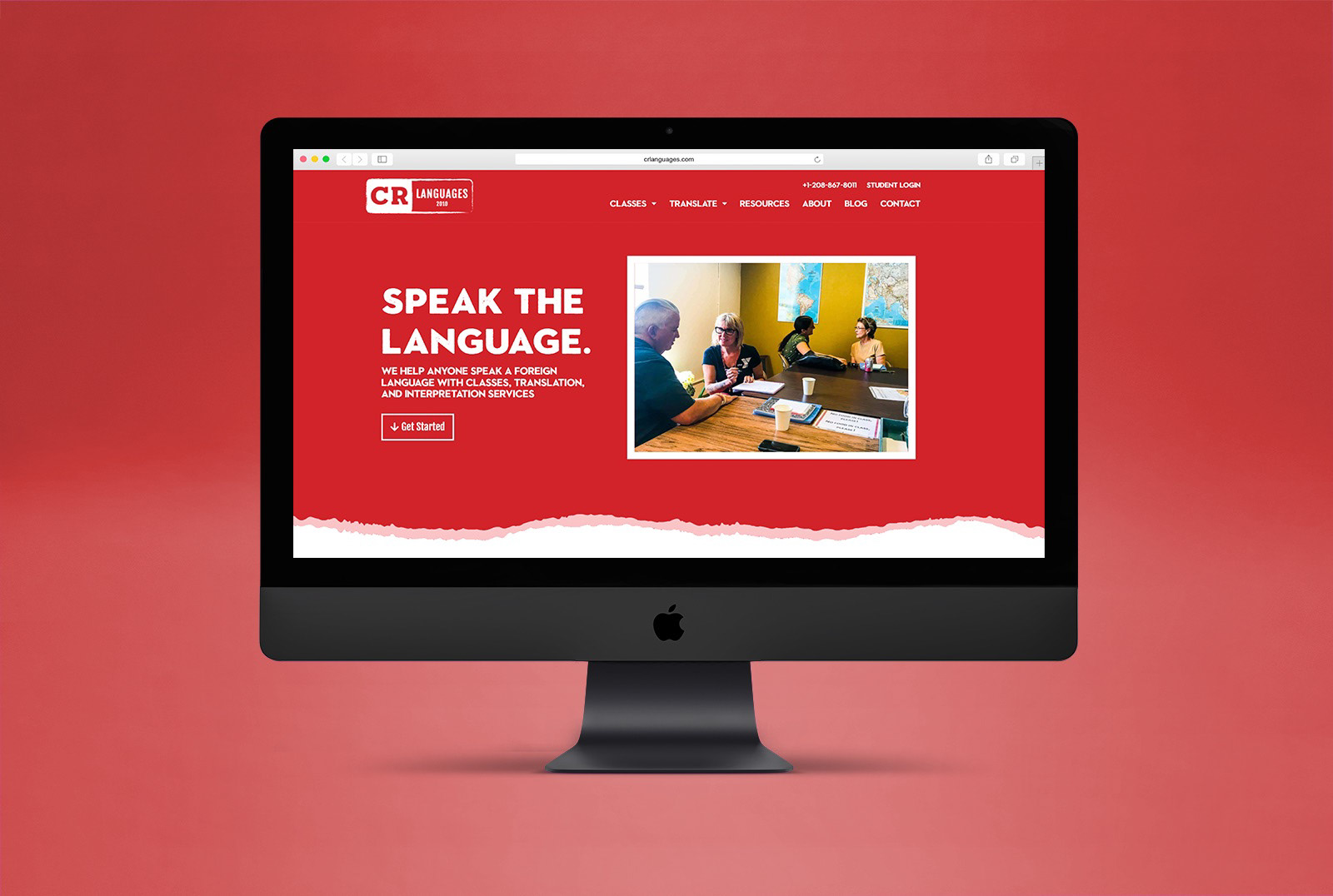
CR Languages is a Boise, Idaho based language school that wanted to update their branding and website to be more contemporary and meet new business goals. They wanted to encapsulate the look and feel of travel——the goal for many of their customers——without appearing outdated or like a travel agency. I was responsible for developing a new color palette, logos, a photography preset, typography, and building the entire site.
Check out the site here.
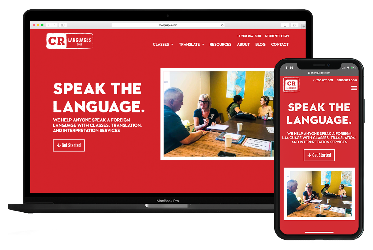
The website is completely responsive for any screen size.
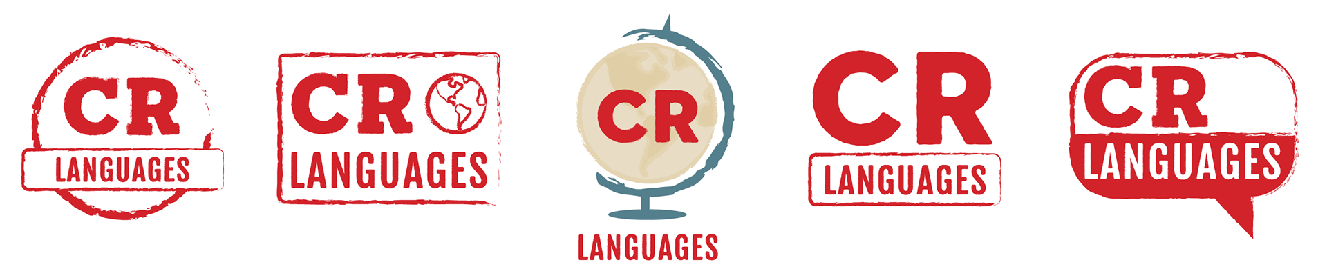
Above are samples from the logo development process. I chose to focus on travel stamps as a source of inspiration for the logo design because of their association with both travel and progress through the language learning journey.
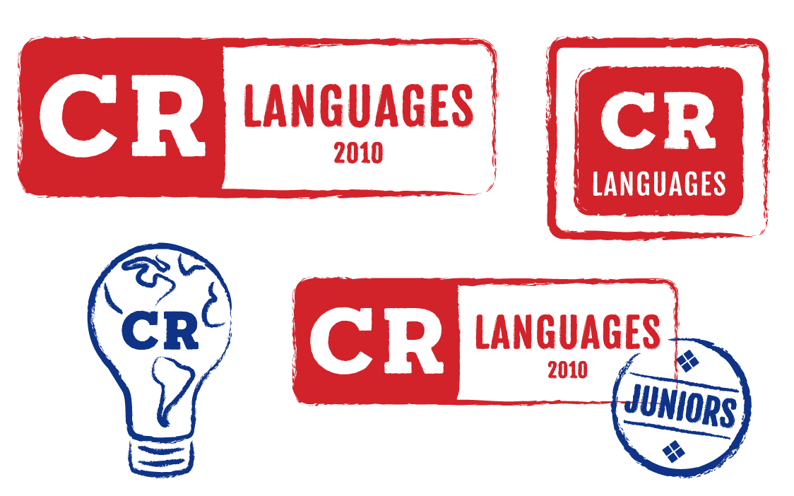
The finalized logo pack features a primary, horizontal logo, a square logo variation for more horizontally restricted places, as well as alternate logo marks for different parts of the company.